Since I’ve been working at
Minted.com I’ve had a renewed interest in print and have been learning a lot about the new range of digital presses. I recently came across the work of
Erin Jang, a designer from Seattle who is currently making a name for herself in New York. She graciously offered her design wisdom to talk a little about a digitally printed wedding suite she did this summer. Digital has come a long way and designers like Erin have really shown how you can make digital look high-end. Good bye letterpress!
 nftzg:
 In Margaret & Brian's wedding invitation suite did you get these printed offset or digital?
Erin: The invitations were printed digitally at a local printer. The quality of their printing is superb. The paper was a thick 120 lb. paper that I hand-scored and folded to keep it very very precise.
nftzg: It looks like you're using Futura Book and a slab-serif, what's the name of the slab face?
Erin: I used Futura Medium and Stymie; I liked the way they work together.
nftzg: What's behind the type choice? I like the combination.
Erin: I love Futura and use that a lot in my invitation designs. It's clean and modern, and Stymie pairs well with Futura because it also has clean geometric lines and is not overly embellished. I'm not partial to the formal scripty fonts and calligraphy most people use on their invitations (with the exception of something that looks vintage, like Memoriam which I used in
Marci and Ben’s invitation set. I think a wedding invitation can look just as sophisticated and formal without the default script fonts.
 nftzg:
 What are some of your other favorite typeface combos?
Erin: I really like to pair fonts that have flair or character with very minimal and clean sans serif fonts. These days I like using an all-caps condensed sans serif font (like Trade Gothic Condensed or Heroic) very small, with something like Modern No. 20 or Miller Display.
nftzg: Do you do your own illustration work?
Erin: Yes. I started out doing illustration work for the Seattle Times newspaper, creating
illustrations and collages for the daily paper. I love being able to illustrate my custom wedding invitations — it's fun to translate the specific details of someone's wedding (the way the bride's dress looks, the plants and flowers at a venue, the food on the wedding menu, etc) onto an invitation.
 nftzg:
 Where do you find your inspirations for the illustrations?
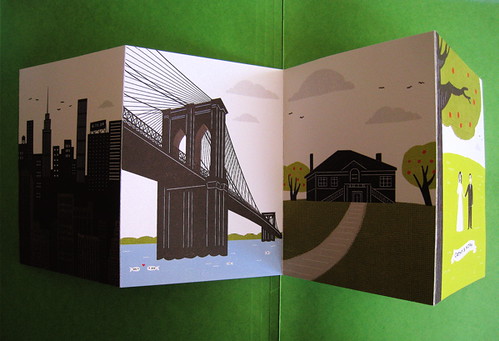
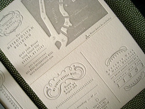
Erin: The illustrations on the invitations I create are always inspired by the details of my client's wedding. For Margaret and Brian's invitations, their ceremony took place at a chapel with this
architectural exterior. I used this design motif to inspire the front folds of the invitation. The inside was inspired by the reception venue, Salvage One, a warehouse with vintage chandeliers and mid-century modern furniture. I asked the bride to take photos of her favorite chandeliers in the space and those are the ones I illustrated.
 nftzg:
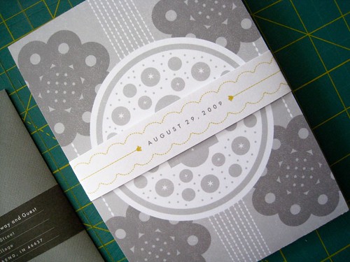
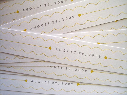
 What inspired the wonderful details on the belly band?
Erin: The bride wanted the color yellow on the band. I wanted something minimal that would allude to the design of the rest of the invitation. The ceremony chapel sits on Lake Michigan, so the scalloped lines were meant to mimic waves, and the curves of the church's circular designs. The small yellow flowers are taken from one of the chandeliers I illustrated inside.
nftzg: How do your clients typically respond to your work?
Erin: I've been fortunate to work with clients who understand my style and are good about communicating what they are looking for in an invitation. They tend to have very unique weddings, a lot of personality in their own style, and so far, they all have trusted me with the execution of the idea or concepts I presented to them. For example, I just worked with a wonderful couple named Marci and Ben; they were a dream couple because they were excited to try something non-traditional, outside of the standard wedding format, and that opened a door to creating something
truly unique for them.
 nftzg:
 I'm sure they loved their invitations, but with non-critical feedback, how do you enforce the level of quality that your work exudes? How many revisions does it typically take you to get to the final product?
Erin: My clients and I always have a healthy dialogue going on. I usually send a few sketches and ideas to a couple, which they review and give me feedback on. We work together to finalize one concept before I start designing. Any major revisions happen at this sketch stage. I'm very critical when it comes to my own work so I'm often my own worst enemy. A lot of times I will hate something I am working on, will come back to it a few days later and change it, tweak it and rework it until I am happy with the design.
Moar awesome work at
http://www.theindigobunting.blogspot.com/.